

Redesigning a dynamic website for Pod Hotels in NYC to increase online booking conversions
Role:
Team Designer
Tools:
-
Figma
-
Google Analytics
Deliverables
-
User Research
-
Low-Fidelity Prototypes
-
High-Fidelity Prototypes
Background
The Pod Hotels are a multi-property independent budget hotel chain in New York City. They have 4 different locations, each with their own amenities and policies, among other things, and thus, their own sub-sites. I worked on this project while I worked at Skipper Hospitality. They came to us to redesign their entire website to increase direct bookings and improve the sites accessibility and navigation. They asked that we maintain the brand identity. I was on the team for the entire project including research and prototyping but led the creation of the design system and quality assurance testing.
The Process
-
Understand the Project Goals
-
Understand the Current Users
-
Competitive Analysis
-
Original Site Audit
-
Site Map
-
Build Design System
-
Prototype
-
Quality Assurance Testing
Understanding Project Goals
As previously stated the main goals of this project were to increase direct bookings as well as improve site accessibility and navigation of the site. These goals were defined across several conversations with the client.
Understanding Current Users
We were given access to the hotels Google Analytics dashboard and used a lot of that data to help inform our design decisions. The time of this project was during the height of the pandemic so data was skewed so we mainly relied on data from the previous 2 years. With this data along with stakeholder conversations, we determined that their ideal user are artsy millennials booking weekend getaways.

Compitetive Analysis
We conducted a competitive analysis on about 10 hospitality websites that have a similar target user. We pulled components we liked from each website that we believed could improve the experience on the Pod site. These three in particular did a good job of use color in a way that doesn't feel overpowering or hard on the eyes. They also use a lot of different sized and oriented cards in a way that feels very clean.


Site Audit
Most of the issues that we noticed during this audit were with the design, responsiveness, and spacing of card components. At this time we also took inventory of all the components that are currently on the site and made note of which ones we could keep and which ones were unnecessary.


Site Map

We built out the site map for the original site and realized that there is a lot of room for simplification, so user retention we streamlined the sitemap in order to have less areas of disengagement. For example, each site had a gallery page but there was also a gallery on the main site that had a preview of the gallery for each property. This page had significantly lower page views and significantly higher bounce rate so we took it out completely.
Design System
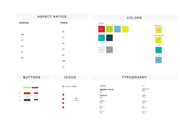
We did an atomic design system but also created a system overview organized components by type that was easier for development and business teams to follow.
See full design system
Most parts of the brand identity remained the same including the logo and typography. We did, however, update the color palette to increase the color contrast and reduce the brightness; we also assigned unique colors to each property to help identify which property a user is interacting with. We also included aspect ratios for each picture we planned to use as requested by the development team.
- The main work was around redesigning card components on an 8-point grid for both mobile and desktop screens. All of these components were built with auto-layout and most had multiple state designs. We made sure to follow naming conventions that made sense to both the design and engineering team.
Prototype
After a few iterations, testing and approval from our clients, we landed on one prototype. Because we had sub-sites for 4 different properties, we relied heavily on our component variations to make the prototype build seamless. Pictured here is the original side on the left with our updated prototype on the right.
View Full Prototype
Quality Assurance Testing
We got the product into production but, unfortunately, I didn't work with the analytics team to get results before my departure from Skipper Hospitality When our project made it to development in Webflow, inevitably there were some bugs. There were already some delays in the design process and we wanted to get this project through development as quickly as possible, so I led quality assurance efforts as I was extremely familiar with the design system. I flagged any bugs I noticed in the staging site and made any necessary updates to the design system at the development teams' request to make their jobs easier.

Reflection
This project taught me a lot about the importance of design systems. This project saved our team weeks in design and hand-off to development time as compared to our previous projects. I even had members of the development team tell me the level of organization and detail in the design system made their job easier. This was the first project at Skipper that we held development off until after we had a full atomic design system built and since then we completed every other project in this way.
This project also taught me a lot about managing client relations. Typically on hotel website builds we would work directly with the general manager (GM) of the hotel. During the early stages of this project we worked with one GM, but being that this was a multiple-property hotel, there were multiple managers, sometimes with opposing opinions. We worked hard to try to navigate everyone's schedules, their opinions, and trying to design a website that could get to development on time. Because we often couldn't arrange a time for all the stakeholders to meet, I would send out bi-weekly emails with any updates, questions, or assets we had. Unfortunately, we still ended up having to redesign approved designs multiple times, but I think having the design system where we could make alterations to components without having the update each individual screen definitely helped us to save time and get our designs to development ahead of schedule.
Let's Connect
