

Designing a data story for the Black Innovation Alliance
Role:
Lead Researcher + Team Designer
Tools:
-
Figma
-
UserTesting.com
-
Maze
Deliverables
-
User Research
-
Low-Fidelity Prototypes
-
High-Fidelity Prototypes
-
Quality Assurance Audit
The Goal
I came across the opportunity to volunteer for the The Black Innovation Alliance (BIA) through a mentor who recommended me. The BIA commissioned this project in order to understand the gap that exists in support for Black innovators and provide access to the resources that exist to help fill that gap. A Black innovator support organization (BISO) is a Black-serving and Black-led or -run organization that aims to bring resources, whether financial or education, into the Black Innovation Ecosystem (BIE). The BIE is made up of founders and entrepreneurs, tech professionals, and creative technologists.
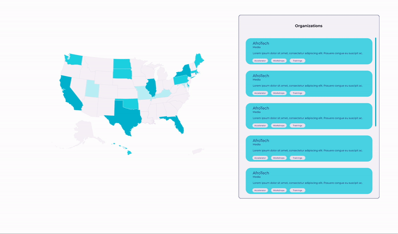
My main responsibility was designing the map that would show BISOs active in the U.S. Based on the research conducted by the product manager and research team, I inferred that innovators need to find organizations that align with their own goals and are geographically accessible to them. With this, I suggested that the map would need to be filtered by organization type as well as location.

Research
My process for designing the map feature began with researching different types of map interactions. Based on research on dozens of types of data maps, I narrowed my search to the bubble map and the choropleth map, as they were both widely used to separate geographical areas by numeric values. I decided to then test the interaction for both, focusing more on how it would work than how it would look.
I tested these designs on 4 friends using a mobile screen. All 4 of them had trouble clicking on one or more of the identifying circles in the bubble map. For this reason, I decided to move forward with exploring designs with the choropleth map, which uses colors and shades to communicate numerical data associated with geographic regions.
Solutions
Again, my focus is more so on the interactiveness of the map (i.e. what happens when a state is clicked, how and where the data shows up, how users find data they're looking for). At this stage I designed as many versions of the choropleth map I could think of including the data that would be included, and any animations and interactive elements.

After a few rounds of iterations, we decided on the design below for three main reasons:
-
Stacking the content horizontally allows users to see valuable information earlier on
-
Adding thick outlines around clicked states and changing the content in the component to the right ensures that all people, even those with vision impairments will be able to notice changes
-
Adding tags to each card opens the door for a more robust filter search in the future when time and resources allow

Quality Assurance
After the site was built, the next phase of this project was to perform a complete audit on the website in order to begin the testing process.

Some of the issues identified (each paired with a possible solution I would have liked to implement given the opportunity):
-
Issues concerning accessibility
-
These issues were identified and solved through the use of the webaim.org WCAG compliance contrast checker
-


-
Mobile issues


-
Information hierarchy issues
-
Based on previous research we discovered that Black tech professionals want to be able to see the Black support organizations available and accessible to them. Our hypothesis was that a map would help users identify support organizations near them but at the time of our audit, the map was all the way at the bottom of the page. This issue will require us to test to verify that people are actually using the map and find it useful.
-
Next Steps
In this first stage of design, I really focused on how users would receive and gather information from our data story.
Our next steps will be to conduct usability as well as A/B tests to inform our next round of research, design, and development.

